Settings and design
Design and layouts
Choose the layout of your store locator and store pages, pick the store details to show, and fine-tune each layout on the Design tab.
The Design tab in Settings controls how your store locator and store pages look. Change a setting, then click Save in the bar at the top.
This guide covers:
For colours and fonts, see Colours and fonts.
Display
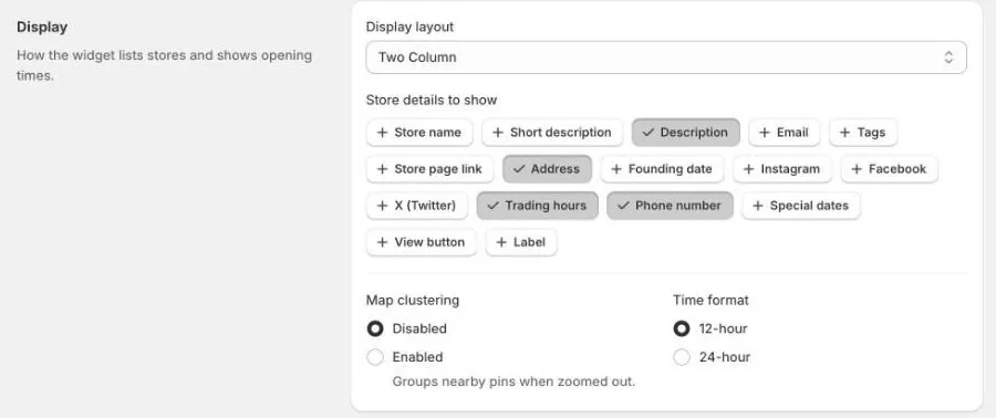
- Display layout: the layout of your store locator page. You can also choose it under Locator layouts.
- Store details to show: click the details you want on each store in the list, such as Store name, Address, Phone number, Trading hours, Tags, Store page link, or a View button. Ticked details are shown.
- Map clustering: when Enabled, nearby pins are grouped into one numbered circle when the map is zoomed out. Turn it on if you have many stores close together.
- Time format: show opening hours as 12-hour (
9:00am) or 24-hour (09:00).
With the List layout, the store details are set by the layout itself, so Store details to show applies to the other layouts.
Store page layouts
The store page layout is used for every store’s own page. One layout is active at a time.
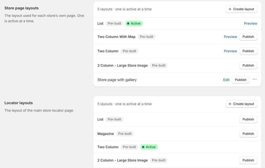
The pre-built layouts are:
| Layout | What it looks like |
|---|---|
| List | The store’s details in a single column. |
| Two Column With Map | Details on one side and a map on the other. |
| Two Column | Details split over two columns. |
| 2 Column - Large Store Image | A large photo of the store beside its details. |
To change the layout:
- Click Preview to see what a layout looks like, where available.
- Click Publish on the layout you want.
- Click Save at the top of the page. The layout is used once you save.
For any layout other than List, choose the details to show on store pages under Store page details to show.
Your own layouts appear in the same list, with Edit and ⋯ (for Delete). To make one, click Create layout. See Custom layouts.
Locator layouts
The locator layout is the layout of your main store locator page. It works the same way as store page layouts: click Publish, then Save.
| Layout | What it looks like |
|---|---|
| List | A store list beside a map. |
| Magazine | A grid of photo cards that open each store’s page. |
| Two Column | A title, a search box, and stores in two columns. |
| 2 Column - Large Store Image | Wide cards with a large store photo beside the details, next to a map. |
Layout options
Extra settings appear below Colours, fonts & more for the active locator layout.
- List layout:
- Title, Description title, Content description, and Content description link: text shown with the list.
- Search position: Top or Sidebar.
- Map position (mobile): show the map above or below the list on phones.
- Show “All stores” link and View all stores URL: add a link to a page listing all your stores.
- Magazine layout: a Title and Subtitle shown above the cards.
- Two column layout: a Title and Description shown above the stores.
- 2 Column - Large Store Image: Store list tabs. The first tab always shows all stores. Click to add a tab, give it a Tab name such as
Tyre fitting, and pick a Tag. The tab shows only stores with that tag.
Custom CSS
For advanced changes, add your own CSS in Custom CSS (widget.css). It applies only to the store locator and is loaded after the theme styles, so it can override them.
Only use this if you’re comfortable with CSS. If something looks wrong after a change, remove your CSS and save again.