Widget settings and design
Colours, fonts, and store cards
Change the heading, store cards, stock banners, Find in Store button, drawer, and custom CSS of the Find in Store widget, and preview it before you save.
Make the widget match your brand in Settings › Widget appearance. Each section has a small preview on the left that updates as you type. Click Save at the top right when you’re done.
Preview the whole widget
Click Preview full widget at the top of the tab. The preview opens on the right.
- Switch between Desktop and Mobile.
- Switch between In stock and Out of stock to see both stock banners.
- Click a section on the left to highlight it in the preview.
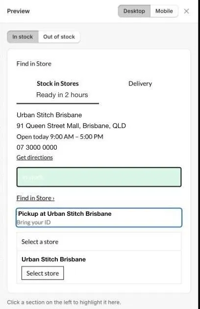
The preview uses a sample store. Check the result on a real product page after you save.
Heading
The text at the top of the widget, for example Find in Store. Set its Heading text, Font Size, Font Weight, and Text colour.
Store card
How each store looks in the list.
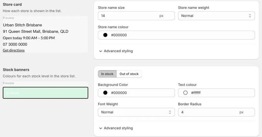
- Store name size, Store name weight, and Store name colour.
- Click Advanced styling to change the Address, Trading hours, and Phone text, and spacing.
- Store card custom CSS: extra styles for the card. You don’t need class names: type CSS properties only, for example
border: 1px solid #e3e3e3;.
Choose which details show on each card in the Tabs section, under Show in store details. See Tabs and tab footers.
Stock banners
The coloured label on each store that shows its stock, such as In stock.
Set banner colours in Settings › Stock. The Stock banners section here previews the banners, but at the moment its changes don’t show on your online store. Use Settings › Stock › Stock banners instead. See Stock levels and messages.
The wording on the banners is also set in Settings › Stock.
Find store button
The button on the product page that opens the widget.
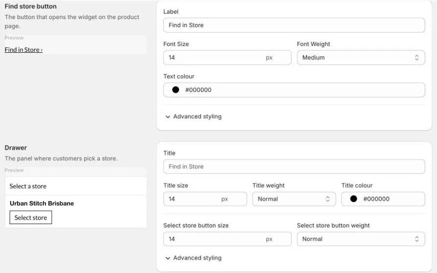
- Label: the button text, for example
Find in Store. - Font Size, Font Weight, and Text colour.
- Advanced styling: line height and spacing.
Drawer
The panel where customers pick a store, used by the Drawer Accordion display type.
- Title: the panel’s heading, for example
Find in Store. - Title size, Title weight, and Title colour.
- Select store button size and Select store button weight.
- Advanced styling: Select store button custom CSS.
Custom CSS
Add your own CSS for the whole widget. Most stores don’t need this. It’s for small changes the settings don’t cover.
Only use this if you’re comfortable with CSS. If something looks wrong after a change, remove your CSS and save again.
Fonts
Choose the widget’s font in Layout & fonts › Font Family. See Display types.